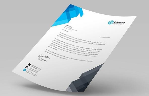
Letterheads are basic business stationery items that many include them when initiating their rebranding campaigns. The few companies which lack document letterheads are usually small-sized or go through their first year of activity. Regardless of their vintage perception, business and personal letterheads make stationery items that any company should store in its all-time files.
How does reading a letter from another company goes? You first notice the letterhead, then read the content. Business partners, clients, and colleagues go through the same process. There’s a visual charm that surrounds letterheads regardless of design trends or business industries. Almost every company uses letterheads. However, not everyone knows how to design and use them successfully.

Essentials of Personal Letterheads for Businesses
Letterheads are necessary business stationery items that everyone in a company can use when they need to send out documents. Most of the employees who use them are managers, accountants, and assistants – due to the frequency they communicate with third parties. To make the discussion clear, letterheads are the designs of document headers. They usually include the company name, logo and contact details. If you own a small business and work on stationery, you can check more samples on templatesassistant.com to find inspiration.
Letterheads have little text with a smaller size than the ones averagely used in documents. Each part of the header includes information that is helpful:
- Document readers quickly acknowledge who the sender is by reading their name.
- Contact details usually include the phone and fax number, postal address and email address which help receivers respond to the document quicker. Some letterheads include the company’s website to draw attention.
- The company logo and optional pattern improve the look of the letter by adding visual information.
There are three ways to use personal letterheads. All of them are essential.
- Inside the company, by ensuring formal communication between colleagues or notifying employees about changes and news.
- Outside the company, in written communication initiatives with business partners, prospects or authorities.
- Outside the company, when notifying clients of changes, contests or promotions.
Traits of the Best Letterheads
Letterheads are critical components of your company’s brand identity. Every document you send out to a third party should have a coherent and consistent look. There are letters, publicity folders, invoices, envelopes and business cards – all of these should use a similar design. Letterheads are occasions when you can use the company logo and design to impress visually. Other said, the header increases your visibility and eases the brand recognition process.
A balanced letterhead should have a simple design with small logos. Although the section seems challenging, designers can add visual interest by inserting background images or continue the pattern they create in the letterhead throughout the entire document. You might also say that letterheads make a declaration of style.
Companies who use letterheads also show recipients that they are reliable and authentic. If attention to detail pays off, then letterheads are the bills that readers see. If the paper your company uses is also high-quality, then clients will have higher potential to contact you. Business communication skills require focus, and letterheads make the hotspots of your attention.
How a Successful Personal Letterhead Looks Like
Here’s how you can design a letterhead to respond to your needs.
- Think about All Stationery Documents. Business documents and papers should have the same look. Therefore, consider designing the company letterheads in line with other stationery.
- Embrace simplicity. The letterhead’s design should be light and easy to read. If you also consider the company motto and other information, review your ideas before adding them to the letterhead.
- Only consider two fonts. You shouldn’t use more than two fonts on the letterhead – one for your company name and another one for contact details. If your logo is a wordmark, then you should only use one font. Remember that the header is on the same page with the document’s content – which integrates another font.
- Use the company’s colors. If the letterhead has a different design than other company documents, it will not be recognizable. Clients won’t acknowledge that your brand is the same one they already know. Therefore, use general corporate brand tones.
- Go original with borders. According to Forbes, a company is as good as its customers perceive it. You can complete the letterhead with borders that integrate it harmoniously into the document’s content and also draw attention to the text.
- Geometry adds a fresh vibe to the letterhead. Geometric vectors are eye-catching and bold. This is actually a trend inspired by digital and app design which works best for web agencies and tech startups. Shapes and gradient color effects create a delightful 3D image of your letterhead.
- What about a column? Letterheads don’t need only to be headers for your papers. You can divide the layout into a left-area letterhead and the content of the letter. The format is widely used for resumes. However, it’s an innovating way to add information about your company.
Wrapping Up Letterheads
Regardless of the design, you choose for letterheads, remember to adapt them to your audience. If clients are cool, provide them with a fresh design. Also, if they are seniors looking for a reliable brand, then you should opt for a classic look.
You can use letterheads in many ways. By adopting them for company communication between colleagues and departments, you also give a chance to your specialists to develop personal branding as members of your company. Find inspiration in personal letterhead templates and create some unique-looking documents!